
CuarteroAgurcia is an independent digital marketing consultancy. The firm is owned and run by 3 partners, a group of friends who are all leaders in their individual fields. We design CSR strategies, Marketing 3.0, branding and identities, digital installations, exhibitions, films, products, posters, and websites from our office in Nicaragua.
Our Brand
An evolution of the brand emphasizes stability, connectivity and modernity.
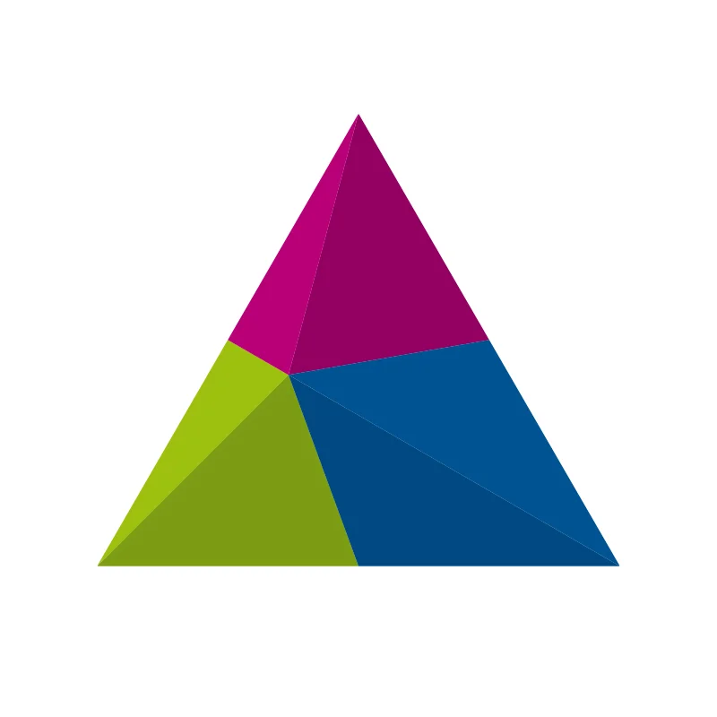
The CuarteroAgurcia brand mark.
Alternate version of the mark.
The iconic magenta, green and blue intersecting triangles of the new symbol are one of the Nicaragua’s most recognized brands. Today the company launches an evolution of its brand identity featuring a new mark that highlights the stability, connectivity and modernity of CuarteroAgurcia and its management systems. Designed by our Creative Director Gabriel Ruiz, the identity brings simplicity and clarity with an increased emphasis on the interconnected triangles, which form the principal equilateral triangle and is optimized for use in digital contexts, an increasingly important part of CuarteroAgurcia’s business.
Our team collaborated closely with CuarteroAgurcia leadership on the project, including Alberto M. Cuartero, Operations Director and Communications Officer and Lissbeth R. Agurcia, CEO. The goal was to convey stability, connectivity and modernity, while preserving the company’s heritage and enormous brand equity. Digital technology is a growing segment of CuarteroAgurcia’s business, and it needed an identity that would help position the brand as a forward-thinking, people-centered technology company. The new mark is designed to work seamlessly across all digital platforms and connected devices.
“Today, it is all about connect people, companies and values, and digital is at the heart of enabling practically everything they do in all spheres of their lives”
The new logo represents both CuarteroAgurcia the company and the full suite of CuarteroAgurcia products and services, creating a single brand system for the entire projects as well as its existing and future products. This replaces a 2010 version of the logo that was meant to distinguish CuarteroAgurcia corporate from the consumer-facing image. The new brand mark will be used across every touchpoint of the CuarteroAgurcia brand, from the products that you can download in the online store, to signage at CuarteroAgurcia headquarters, to the digital platforms on smartphones, tablets and computers.

The previous brand mark.

The evolution of the brand mark over the years.
To create the new symbol, we isolated the brand’s elements to their purest form. From the very beginning, in 2010, CuarteroAgurcia’s brand mark has relied on extraordinarily simple elements: A series of triangles that created an equilateral and volumetric triangle. The Interconnected geometrical forms effortlessly express the idea of connection, while the basic triangular shapes suggest stability and professionalism, key to CuarteroAgurcia’s brand message of “connecting people, companies and values.” The new brand mark preserves and builds on this iconic foundation, providing a crisper look that has flexible configurations more suited for digital applications.
“Through over 5 years of exposure, the equilateral triangle has become so recognizable that it can be reduced to their essence and still communicate CuarteroAgurcia, at scales large and small, analog and digital, and ultimately, even without words,” says Ruiz.
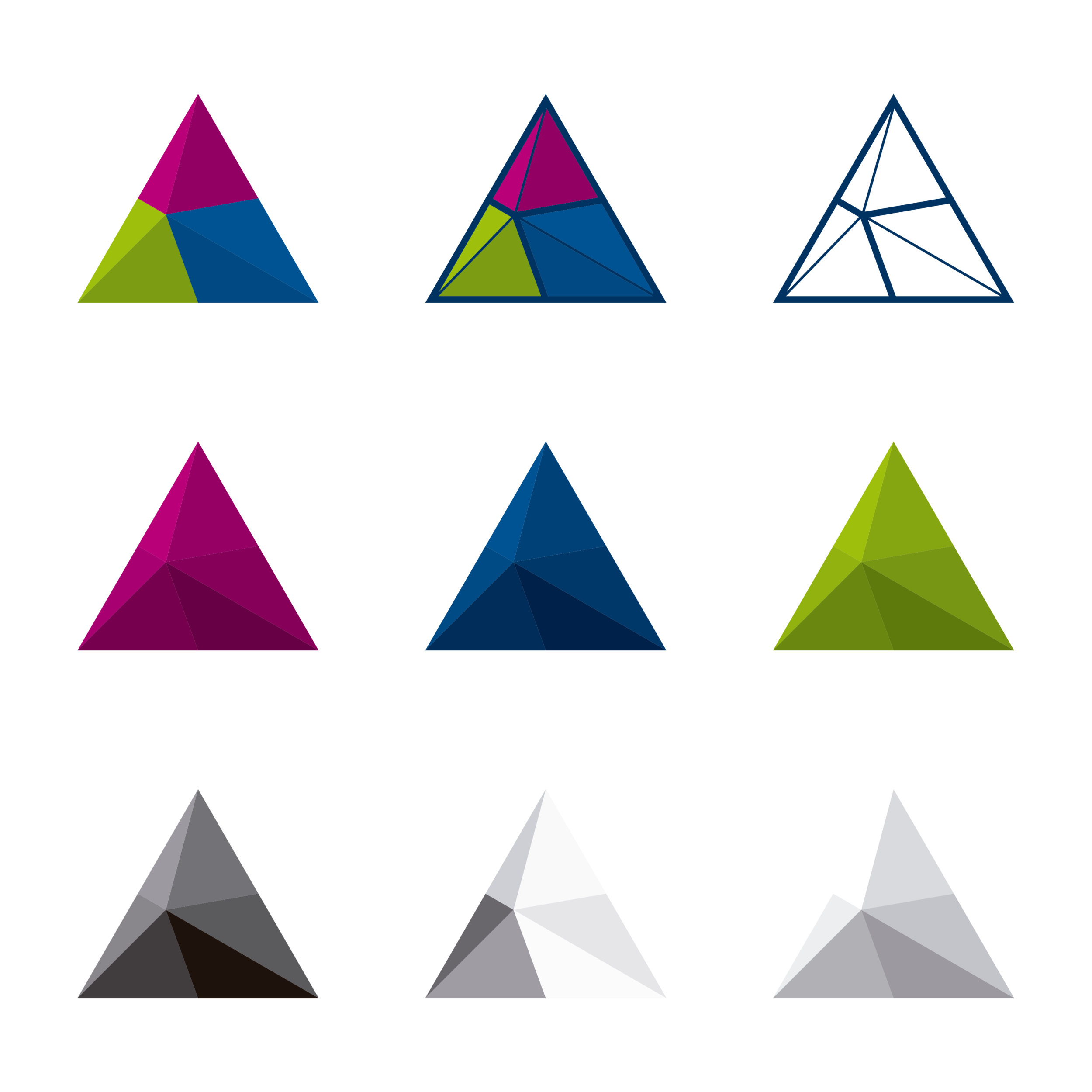
The colors were carefully calibrated to appear bright and glowing against different backgrounds.
“CuarteroAgurcia’s new symbol returns the brand to its fundamental roots,” says Cuartero. “At the same time, its basic characteristics have been used to generate a completely coordinated system of triangle shapes, colors, and typography.”
The entire identity is built using the core elements found in the logo: geometry and color. A new set of graphic tools have been developed to help CuarteroAgurcia communicate effectively and concisely in all media. The tools consist of a distinctive color palette, a new typographic system, and pure graphic shapes with parameters that enable the creation of an infinite series of varied yet connected graphic patterns. In addition, custom icon sets, illustrations and photographic styles have been established to create a consistent visual system to express a wide range of messages.
One of the subtle changes was the elimination of the "&" glyph and the space between the name in the wordmark, as a visual cue to de-emphasize how the brand is no longer just a firm that represents two people, and it becomes in a brand that believes in individual talents and collective intelligence. The lowercase typography is in line with the simple and modern approach, and allows for a consistent treatment in names of products such as #ConectA2017.
The wordmark is set in the contemporary sans serif Helvetica Neue LT Pro 75 Bold. During its research, the team looked back to a version of the New York City Transit Authority Graphics Standards Manual designed by Massimo Vignelli and Bob Noorda from Unimark in 1969, which featured typography with a stable structure. The new typography plays on the perfectly geometric forms of the mark, with tall x-height, which makes it easier to read in smaller sizes and at distance.

Lissbeth R. Agurcia, CEO, Avatar
Alberto M. Cuartero, Operations Director, Avatar

Gabriel Ruiz Martinez, Creative Director


Graphic elements developed for presence in social networks
Getting the three colors in the mark right was a challenge for the designer, requiring hundreds of tests to find the perfect color equivalences that would work successfully in every conceivable context. The logo needed to work on white backgrounds, black backgrounds, and different values in between. This meant that the colors had to be carefully calibrated, so they would stand out and not disappear, and have sufficient contrast from the magenta, green and blue.
In the final mark, the color of the shadows is both lighter than the following and darker than the main pantone, suggesting that the main equilateral triangle has volume, rather than be flat, giving the brand a feeling of tridimensionality. The original CuarteroAgurcia logo used a subtractive color mix: the magenta, green and blue triangles was the main colors, but It was created a darker color, which accompanies each one. The new symbol uses an additive mix—the colors now produce a brighter version of itself. This projects an overall effect that is lighter and fresher, giving the symbol a subtle glow and a bolder, more optimistic feel.
In applications, the graphic elements complement the typography and are built parametrically around mathematical principles found in the mark. Coupled with the power of computing, the parametric design generates infinite arrangements, each different from the next, though all part of the same visual system.