A.C. Milan iOS
AC Milan is a remarkable football club with a rich history dating back to 1899. Throughout its existence, the club has been a mainstay in Serie A, the top flight of Italian football, with only two brief exceptions. AC Milan has achieved incredible success, claiming 18 FIFA and UEFA trophies, the most of any Italian club and joint fourth-highest globally.
The club has earned a reputation for excellence on the international stage, having won seven European Cup/Champions League titles, including more than any other Italian team.
Additionally, AC Milan has secured a joint-record three Intercontinental Cups, one FIFA Club World Cup, the UEFA Super Cup five times, and the Cup Winners' Cup twice.
With 18 league titles, AC Milan is among the most successful clubs in Serie A history, equaled only by local rivals Internazionale and second only to Juventus with 34 league titles. The club has also secured five Coppa Italia titles and seven Supercoppa Italiana wins. AC Milan is a true inspiration to football enthusiasts worldwide.
Challenge:
Improve Milan's user interface while maintaining the integrity of its core features.
My Role:
Perform user research, create sketches, design static interfaces, and create illustrations for icons.

Research and Goals
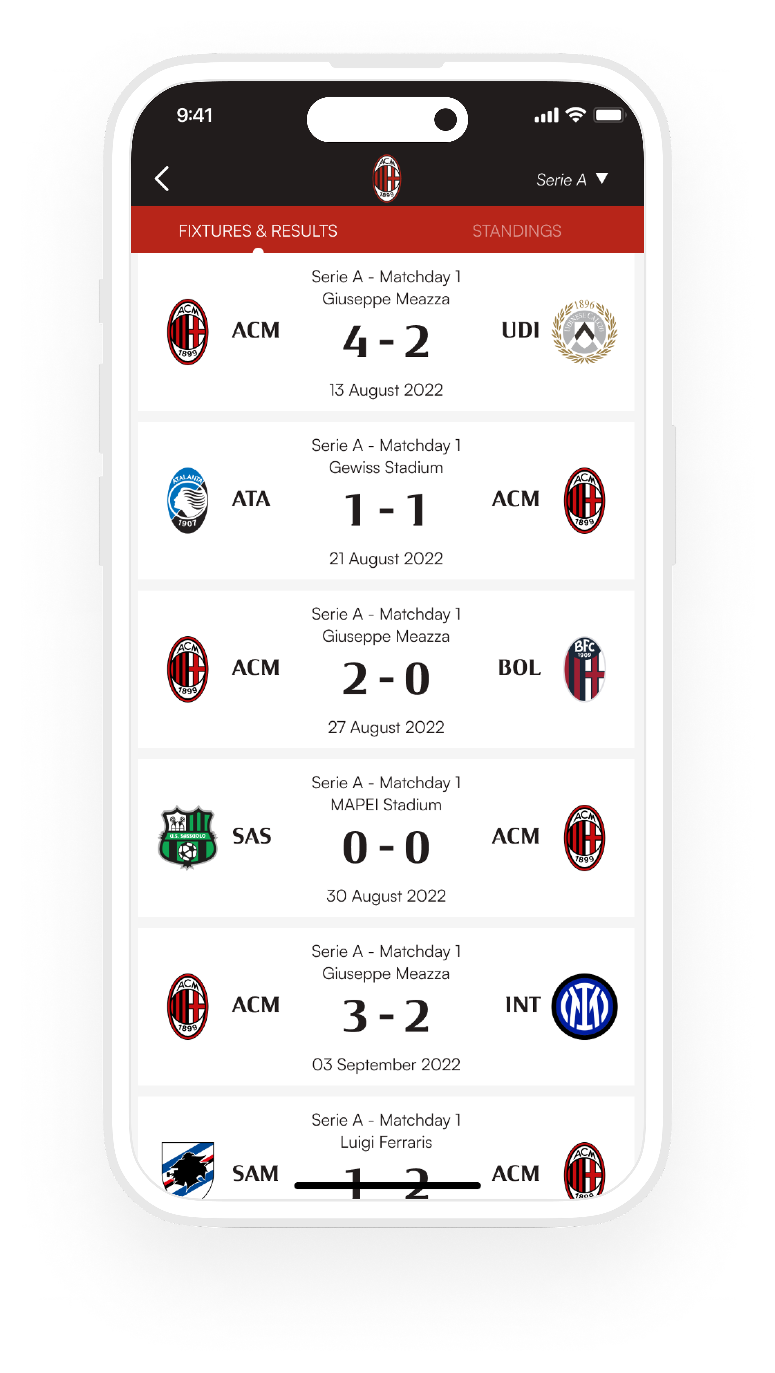
Speaking with Milan’s previous app users, we identified questions that often came up for current and new users, isolating pain points and assembling a timeline for what users experience as they progress through the app. Where were users dropping off? Why? What elements of the Menu were confusing or unclear? Why? Were there any patterns that seemed to cause a drop in engagement? Why?
From this research, we established that navigation was holistically confusing to users, and they had difficulty understanding how different views within the Live Score were related. To solve these problems, we decided to redesign the Live Score experience by laying out the following goals:
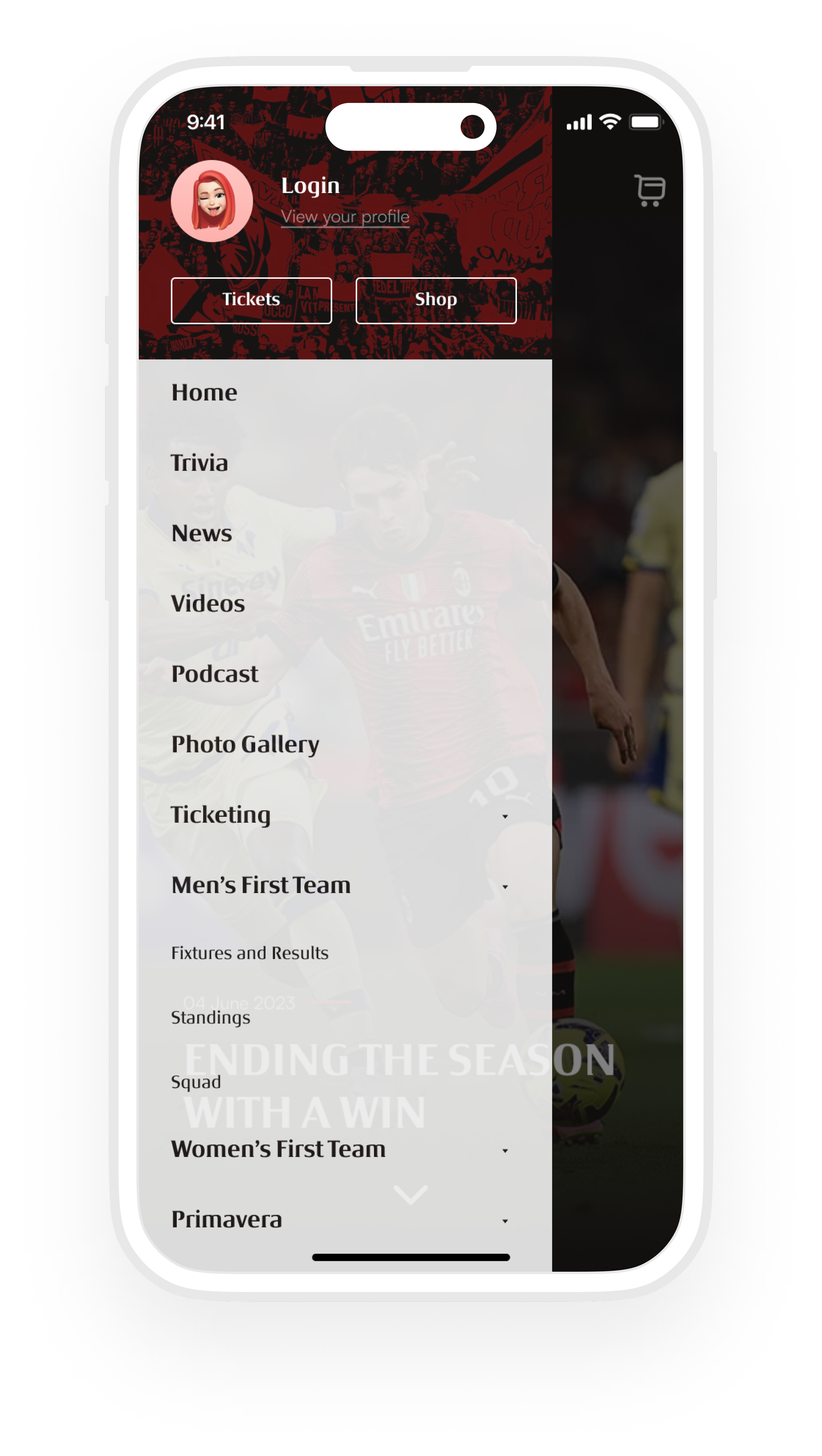
Strengthen visual hierarchy and clarify navigation everywhere, including designing a new icon set that is extensible and legible at small sizes
Reduce and eliminate inconsistencies by establishing conventions for how pages should be laid out, how buttons should be positioned depending on their purpose, and how copy should be written
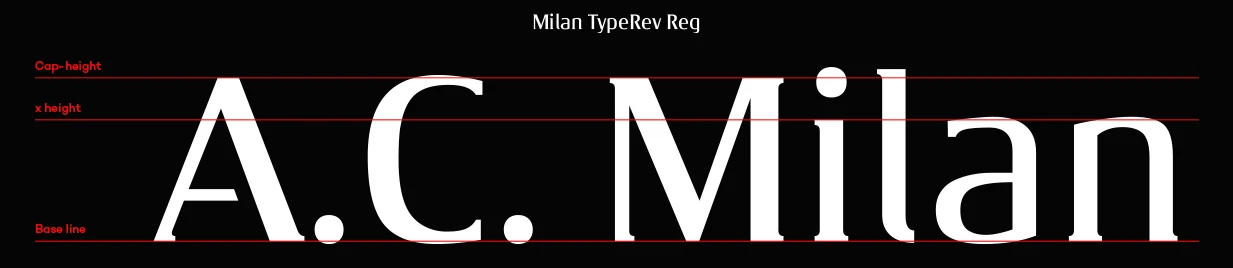
Design and implement a more appropriate interface font that can also be used as part of the Milan brand
Clean up and organize the Main Menu, establishing and enforcing naming rules to help maintain consistency, reduce technical debt, and simplify future changes.
Due to organizational limitations, these changes had to be made solely in the front end without touching the app's core functionality. This limited some of our more aspirational redesigns. Below are the solutions we arrived at for the points above, along with how we transformed the Live Score section using user data to guide design decisions.